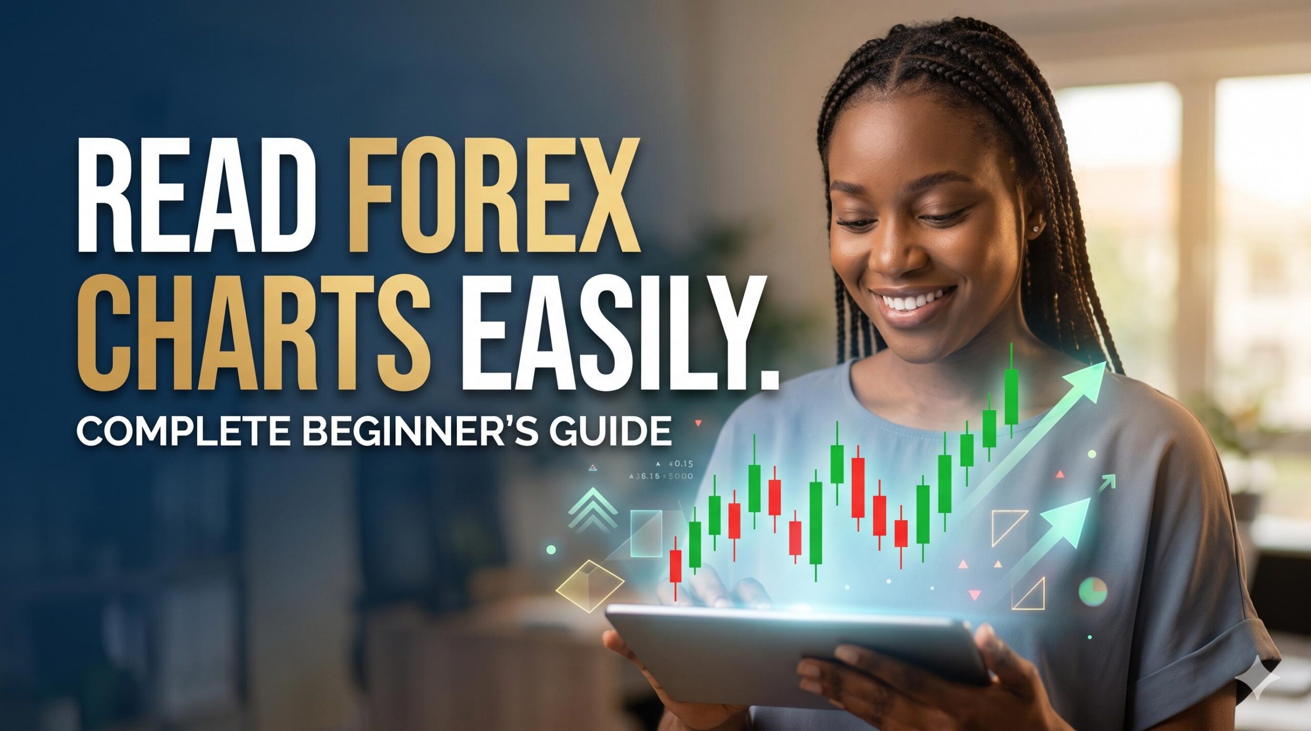
To learn how to read forex charts easily, you must focus on three core components: the price axis, the time axis, and the candlesticks. A forex chart is a graphical history of a currency’s value. The vertical axis on the right shows the price, the horizontal axis at the bottom shows time, and the candlesticks in the middle represent price movement. A green candle indicates the price rose during that period, while a red candle shows it fell. By identifying the “Open” and “Close” of these candles and observing whether they are moving generally upward or downward, anyone can interpret market direction without complex tools.

At earnfx.ng, we believe that every Nigerian trader should start with a solid foundation. Understanding these visual cues is the first step toward navigating the global currency markets. Please note that this guide is for educational purposes only and does not constitute financial advice. Trading involves significant risk, and you should never invest money you cannot afford to lose.
Introduction: Why Chart Reading is Your First Superpower
For many beginners in Nigeria, opening a trading platform for the first time can feel like looking at a secret code. You see flashing numbers, red and green bars, and zig-zagging lines that seem to move without logic. However, the ability to read forex charts is the primary skill that separates a disciplined learner from someone just guessing.
A forex chart is simply a “story” of human behavior. It shows you exactly what thousands of buyers and sellers thought a currency was worth at any given minute, hour, or day. When you learn how to read forex charts easily, you stop seeing random noise and start seeing patterns, trends, and opportunities. In this guide, we will break down the complex visuals into simple, manageable pieces that you can master in a single sitting.
Table of Contents
The Basic Layout of a Forex Chart
Before you look at the “shapes,” you must understand the “map.” Every forex chart is built on a simple grid system.
")
1. The X-Axis: Time
The horizontal line at the bottom of your screen represents time. As you move from left to right, you are moving from the past toward the present. Depending on your settings, each “step” on this line could represent one minute, one hour, or one day.
2. The Y-Axis: Price (The Exchange Rate)
The vertical line on the right side of the chart shows the price. In forex, this is the exchange rate between two currencies. For example, if you are looking at the USD/NGN (US Dollar vs. Nigerian Naira) chart and the price on the right says 1,500, it means 1 US Dollar is currently worth 1,500 Naira.
3. The Currency Pair
In the top corner of every chart, you will see the pair you are viewing (e.g., EUR/USD). The first currency is the “Base,” and the second is the “Quote.” The chart tells you how much of the Quote currency you need to buy one unit of the Base currency.
Mastering Candlesticks: The Language of Price
The most popular way to view price is through Japanese Candlesticks. These are preferred because they pack four pieces of information into one simple shape.
Each candlestick represents a specific period of time (e.g., 1 hour). It consists of two parts:
- The Body: The thick, colored part. It shows the distance between the price when the hour started (Open) and when it ended (Close).
- Green/White Body: The price went up. The bottom of the body is the Open; the top is the Close.
- Red/Black Body: The price went down. The top of the body is the Open; the bottom is the Close.
- The Wicks (Shadows): The thin lines sticking out of the top and bottom.
- The Top Wick shows the highest price reached during that time.
- The Bottom Wick shows the lowest price reached.

By looking at the size of the body compared to the wicks, you can easily read market sentiment. A long green body shows strong buying “momentum,” while a long upper wick shows that sellers are starting to push back.
Understanding Timeframes
A common point of confusion for beginners is seeing a price go “up” on one chart and “down” on another. This usually happens because of timeframes. You can choose to see the market through different “lenses”:
- Short-term (M1, M5, M15): Every candle represents 1, 5, or 15 minutes. These are used by “scalpers” who make very fast trades.
")
- Medium-term (H1, H4): Every candle represents 1 or 4 hours. These are the most popular for beginners because they show the “daily rhythm” without being too fast.
- Long-term (D1, W1): Every candle represents a day or a week. These show the big economic trends.
Pro Tip: To read charts easily, always start with a Daily (D1) chart to see the overall direction, then zoom in to a 1-hour (H1) chart to see the current detail.
How to Identify Market Trends

Once you can read a single candle, you can start reading groups of candles to find a trend. There are three main types of market movement:
- Uptrend (Bullish): The chart makes “higher highs” and “higher lows.” Visually, the price is climbing toward the top right corner.
- Downtrend (Bearish): The chart makes “lower highs” and “lower lows.” The price is sliding toward the bottom right.
- Ranging (Sideways): The price is stuck between a “ceiling” (resistance) and a “floor” (support). It moves back and forth without a clear direction.
Reading the trend is vital because it tells you whether it is generally safer to look for “Buy” or “Sell” opportunities. As the saying goes, “The trend is your friend.”
Understanding How Naira Devaluation Impacts Forex Traders in Nigeria
A Simple 5-Step Routine to Read Any Chart

To make this process easy, follow this mental checklist every time you open a chart:
- Identify the Pair: Am I looking at EUR/USD or GBP/JPY?
- Check the Timeframe: Am I looking at the 1-hour view or the Daily view?
- Spot the Trend: Is the price generally going up, down, or sideways?
- Find Current Price: Look at the right-side scale. What is the live exchange rate?
- Look at the Last 3 Candles: Are they mostly green (buying pressure) or mostly red (selling pressure)?
Frequently Asked Questions (FAQ)
What is the best type of chart for a beginner?
The Candlestick chart is widely considered the best. While “Line charts” are simpler, they only show the closing price, which hides the volatility (the highs and lows) that occurs within a session.
Why are some candles bigger than others?
The size of the candle body represents volatility and volume. A very large candle means there was significant trading activity and a large price move. A tiny candle (sometimes called a Doji) indicates indecision where the market didn’t move much from its starting point.
Do I need to be good at math to read forex charts?
No. Modern trading platforms do all the calculations for you. Your job is purely visual—learning to recognize shapes, colors, and directions.
Can I read forex charts on my mobile phone?
Yes. Popular apps like MetaTrader 4 (MT4), MetaTrader 5 (MT5), and TradingView allow you to view live charts on your phone. However, most professional educators recommend using a tablet or laptop for a clearer view when you are first learning.
How do I know when the price will turn around?
While charts show the past, they don’t guarantee the future. Traders look for “Reversal Patterns” (like a long wick at the top of a trend) to guess when a move might be ending, but there is always a risk that the trend will continue.
Conclusion
Learning how to read forex charts easily is like learning a new language. At first, you only recognize a few words (colors and lines), but with practice, you begin to read full sentences (trends and patterns). By focusing on the relationship between time, price, and the four data points of a candlestick, you gain a clear, objective view of the global financial markets.
Remember, the goal of chart reading is not to “predict” the future with 100% certainty—that is impossible. Instead, it is to understand the current balance of power between buyers and sellers so you can make informed decisions.
Keep your analysis simple, stay patient, and always prioritize risk management. Your journey as a trader in Nigeria starts with understanding what the screen is telling you. Happy learning!
Risk Disclaimer: Forex trading carries a high level of risk and may not be suitable for all investors. The high degree of leverage can work against you as well as for you. Before deciding to trade foreign exchange, you should carefully consider your investment objectives, level of experience, and risk appetite. The possibility exists that you could sustain a loss of some or all of your initial investment and therefore you should not invest money that you cannot afford to lose. All content on earnfx.ng is for educational purposes only.